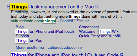
Here’s a quick one for you kids. I’ve just started playing with CSS3 and I needed something simple but useful to implement. Say what you will about Safari as a browser but I think its find feature has the best UI for showing matching results on the page and what item is currently selected. Wait, you don’t use Safari? Okay, check out the picture below.
See what I’m saying? Fade out what isn’t important, lighten all matches, put some special pizazz on the current item. As an added bonus each time you switch the current item it “pops” a bit to help pull your eye to where the next item is. Pretty slick.
I set out not to duplicate the styles but to get a feel for CSS3 animation and transitions. With that in mind the animation tweens and colors aren’t exact but they’ll work for the project I have in mind. If you have improvements go ahead and share them in the comments.
[Ninja edit] I forgot to mention that in order for CSS transformations to be hardware accelerated by devices that do so you have to include the “translate3d” property. If you don’t need to translate, use the meaningless zeroed out setting like I did below.
[Ninja edit 2} Also, I didn’t bother putting in all the different vendor prefixes. If you’re interested in this code your Google-fu will be strong enough to look up the different vendor settings and adjust accordingly.
@-webkit-keyframes pulseFocusedOverlay {
	0%, 100% {
		-webkit-transform: scale(1) translate3d(0px, 0px, 0px);;
	}
	15% {
		-webkit-transform: scale(1.35) translate3d(0px, 0px, 0px);;
	}
}

.searchMatch {
	display: inline-block;
	padding: 0 4px;
	margin: 0 -3px;
	-webkit-box-shadow: 0 1px 5px #333;
	box-shadow: 0 1px 5px #333;
	color: #222;
	background-image: -webkit-gradient(linear, left bottom, left top, color-stop(.5, rgb(222, 222, 222)), color-stop(1, rgb(255, 255, 255)));
}

.searchMatch_selected {
	display: inline-block;
	padding: 0 4px;
	border-radius: 5px;
	border: 1px solid #EFDB13;
	margin: -1px -4px;
	-webkit-box-shadow: 0 1px 3px #333;
	box-shadow: 0 1px 5px #333;
	color: #000;
	-webkit-animation: pulseFocusedOverlay 185ms ease-in-out 0;
	background-image: -webkit-gradient(linear, left bottom,left top,color-stop(.5, rgb(238, 207, 0)),color-stop(1, rgb(242, 237, 19)));
}
